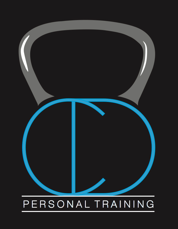
'Chrissy Devlin Personal Training', is about helping people reach their true potential.
Blue was Christopher's chosen colour for this logo as he wanted to continue the tie to his previous logo. I incorporated a light grey into the logo as I wanted another mild colour that married well with the blue without taking away from it, I needed the grey to bring strength to the logo as the business is about strength and conditioning. The colour grey is a timeless and practical colour whilst the colour blue is often associated with depth and stability. It symbolises trust, loyalty, wisdom, confidence and intelligence.
I used the C and D in 'Chrissy Devlin' in a clever and fun way that helped to encapsulate the playful element of his company whilst keeping the logo clean and simple to represent the professional side.
I show the logo against a white background and against black as the logo will be printed onto both dark and light uniforms. This project was both playful and technical as I was encapsulating several messages and meanings through one design.